
GoodGuySign, a conceptual mobile application.
The Problem
The main problem being targeted are users who have the issue of urge incontinence, often times individuals affected are unable to locate a vacant toilet cubicle for use. This is even more apparent for females with this condition.
Duration: 12 weeks
Description
Good Guy Sign is a phone application that aims to help individuals find alternative toilet locations within a 200m radius which translates to a 2 minute walk so that anyone is able to find empty toilets.
Main Target Audience
The main target audience for GGS are females with urge incontinence.
Goal
The goal of GGS is to help reduce the frustration/ minimize the stress induced by walking to a toilet and finding that it is full, mainly to help users with urge incontinence. In this fast-paced society, we do not need additional stress factors in our lives, every little bit of reduction in frustration goes a long way. That is what GGS aims to do.
Conceptualization Process


Research on why females toilets tend to have longer queues. Based on the research I found, postpartum was a huge cause of urge incontinence in females. Females also tend to bring their children to the toilets instead of their male partners and have articles of clothing that require more time to remove when using the toilets. There is also a lack of toilet availability for females because they require individual cubicles.
Key Pain Points:
- Post Partum
- Require Individual cubicles
- Children
- Clothing
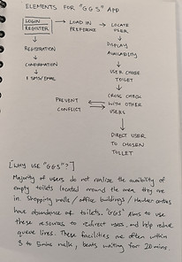
Flowchart & Task flows


During the flowchart and task flow process, I focused on the main purpose of the application which was to locate toilets as soon as possible and provide navigation to the selected toilet. To reduce cognitive load, I also provided the option of providing the route back to the previous location after the user has found the toilet. I believe almost everyone has enough stress in our current society, finding a way to reduce stress levels even a little bit is great.
Low & Mid Resolution prototyping


Created some rough sketches and layouts to test the task flows and reduce any friction when navigating through the application. User testing was done with 10 females. One key point from the majority of testers was that they are very particular about toilet cleanliness. A few had feedback of the application during testing was to include an emergency button in the event that the cubicle did not have any toilet paper left inside, this could allow users to contact another user nearby to help out if needed. Testers also liked the option to provide the route back to the previous location.
Key Take-aways:
- Rating toilets
- Potential emergency button
Wireframes


Based on the feedback that I got from the low-resolution testing, I included the rating system into the wireframe to see how the layout would work out with the other elements that were required for the application. To display the toilets nearby, I decided to go for a list layout to provide a better hierarchy of information with the nearest toilets located right at the top in descending order. I also included the option to route back to test readability and layout for popups.
After testing, the feedback from testers was to include the toilet ratings when displaying toilets nearby as these users are willing to walk slightly further to a cleaner toilet even if it was urgent. They also shared how dirty some toilets can be, with some toilet seats having shoe marks or wet tissue paper all over the toilet seats.
High Resolution mockups


The high fidelity mockups included the previous feedbacks of including the toilet ratings, however, I chose to stick with sorting by distance as the main target audience that suffers from urge incontinence. I decided to go with a light blue pastel colour theme as based on my research, this colour has a calming effect and this may help to reduce stress on the users when using the application. The layout choice of placing the confirmation with the "Nope" option above is to prevent user errors as there are situations where the user has not reached the location but the GPS detect the user as reached.
Style Guide


These are the finalised UI elements and style guide for the application.